
Understanding walkability means examining how easy it is to move around a location by foot. Depending on what you are looking to learn, there are a few different ways to check out the walkability of a location in our tools.
Walkability in Insights Reports
Every insights report includes an “Accessibility” tool, with information about the walkability of the location. The walkability analysis is generated from the centrepoint of each location. In the instant public reports this is the busiest part of the neighbourhood.
HINT: If the instant reports don't provide walkability analysis from your location, then request a custom location to access precisely what you need.
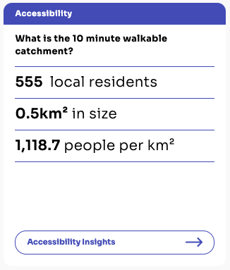
The overview section of every instant report has a summary of the walkability, providing fast facts.
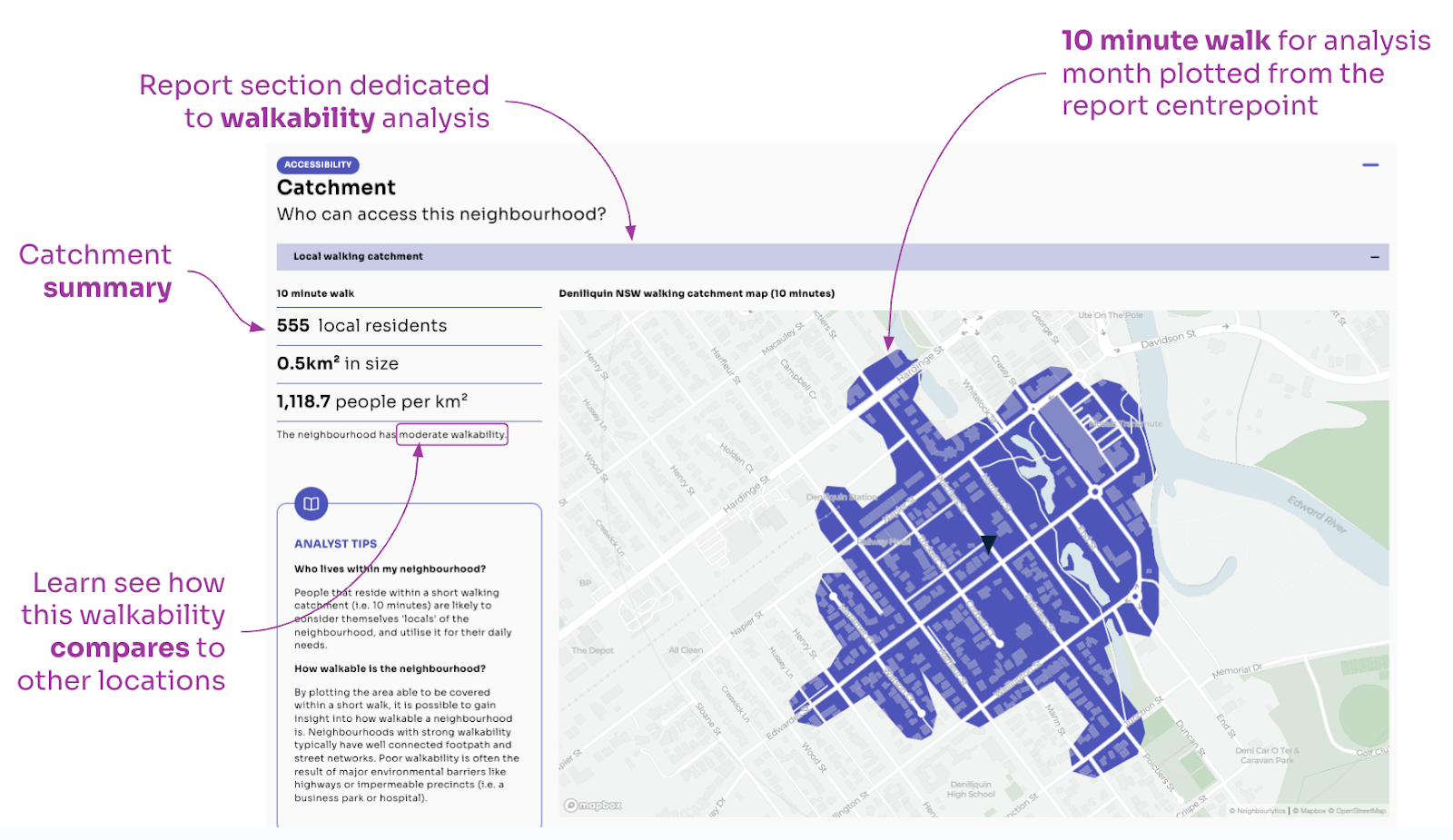
By jumping ahead to Accessibility insights, you can view the report section dedicated to walkability analysis. The map shows the 10 minute walking catchment for the report month (learn more about how walkability may change over time in our article Do place makers really understand walkability?).
The catchment summary provides more detail about the catchment, including its size and population.
HINT: Learn ‘what good looks like’ by comparing your location to any other report. This will give you an instant indication of the relative walkability performance in your location Learn more about comparing.
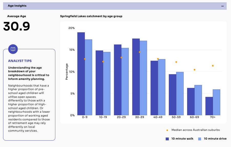
The Age Insights section provides a demographic breakdown of the population from within each isochrone. This residential population is effectively the ‘local catchment’ of the area.
Walkability in Explorer
HINT: Explorer is unlocked for Advanced accounts, or for a single neighbourhood by request. If you don’t have access, you can still try the tools using Sample locations in the menu.
To examine walkability from various locations across the neighbourhood, use the “Go to Explorer” button below your walkability map.

Once in Explorer, use the walking and driving catchment tool buttons in the top-right corner of the map.
- Select the walking catchment you need. For example, walk > 10 for a 10 minute walk
- Select a point on the map to generate the walking catchment from (note that you must select one of the places)
- Once you have generated your isochrone plot, you can change it by toggling other options in the top menu
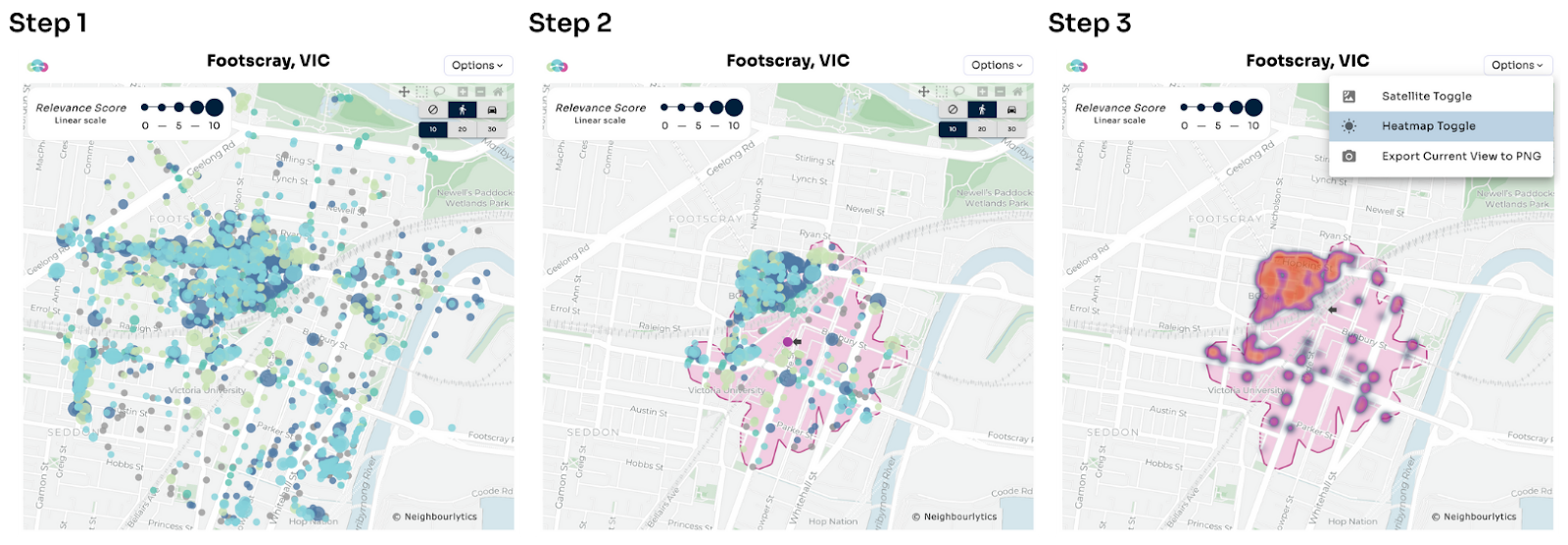
Once you have added the isochrone plot to your map, this will also now work as a filter in all of your amenity tools. This means when you take a look at the Amenity Mix chart, it will show the amenity mix for the 10 minute walk.

About this data
Isochrone Plot
Isochrone: a plot on a map showing the area that can be reached within a certain travel time and mode. For example, a 10 minute walk isochrone.
The walking isochrone maps show you how far people can walk from a specific destination in a specific time, by considering typical walking speeds, and geographic conditions - such as available routes and barriers.
The plot is generated from a publicly available base map, which is updated in real time, meaning real life changes to the pedestrian network will change the isochrone results.
Residential Population calculations
The residential population within the irregular isochrone plots are calculated utilising aerial photography to estimate population density. This means the residential population is not assigned to roads or parks, while higher densities of residents are assigned to high rise buildings. While this will not be 100% accurate, it is an intelligent interpolation of a known population total, across the built form of an area.
Jump into your account to take a look
Want to know more about the value of walkability in place management? Take a look at this article: Do place makers really understand walkability?